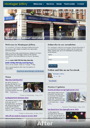
How I increased Montague Jeffery website conversions by 400%
The old Montague Jeffery website converted customers mostly who have been looking specifically for Montague Jeffery by name because they have been referred, or existing customers who wanted to look at the most recent updates (e.g.: check shop opening times, look for noteworthy product updates).
It was ineffective for various reasons however.
News soup
The first thing that struck me was the conglomeration of different news items on the front page.
What combining the different types of news together into one content stream does is make the products and shop news difficult to distinguish between without forcing the user read through the content, therefore requiring more mental effort to process the content and increasing the chances of the user giving up due to weak information scent. For example, if product specific news is buried under 3-5 news items about the shop, how likely is a user going to continue reading past them if he just wants to know if we have new shirts?
My solution to improving the information scent of relevant product updates and news to customers was to separate news and product updates into two separate sections.
To the point
![MontagueJefferyNews[1]](http://denegibson.co.uk/blog/wp-content/uploads/2013/09/MontagueJefferyNews1.png)
News items are of arbitrary length. When arbitrary news items are posted in full on the front page, some items will be more prominent then others and other potentially more interesting items will loose emphasis.
So all items have an equal chance of being noticed and grabbing the users attention, I posted just excerpts instead. This allows a user to skim through content that has an equal chance of being noticed, in addition to helping keep the visual design of the front page consistent.
Visual creatures
![visualcreatures[1]](http://denegibson.co.uk/blog/wp-content/uploads/2013/09/visualcreatures1.png)
People by nature are visual creatures. With this in mind I added some pictures to help add context to news items.
Adding pictures is seemingly simple, although implementation is more complicated because slow load times is not only bad SEO (Google uses page load speed time as a determining factor) but also it tests the patience of the user. This is because more images means slower load times. Also, there is the question of standardising the way images are added so it can be easily done while maintaining a consistent visual design, regardless of how low or high fidelity the images for the news items are.
One other thing to factor in with the use of imagery is that we want to communicate that Montague Jeffery have a focus on quality and attention to detail. To provide a small teaser of what the product or news might be in relation to, I set a constraint for 200px*100px rectagngles which focus on small indiviual bits of detail.
By constraining the preview images to a small size, you either show something recognisable to customers in the know, or spark curiosity enough so the customer is likely to click on a news item for more information. Keeping the teaser images small also helps with site optimisation, because this reduces the time it takes for the page to load.
Also to put more emphasis on the products or services we want to push, I made better use of the space towards the top of the page by replacing the header with a hero banner
.
SEO optimised content

One reason Montague Jeffery was not attracting so many new customers is that all news items were on one page which diluted the SEO.
To improve the website SEO, the Montague Jeffery website now creates a new SEO optimised page for each individual news item and product update. This makes the pages easier to find via the search engines for a few reasons:
- Search engines like websites which regularly create new quality content.
- When a search engine scans a page to determine how relevant it is to a search engine query, it pays most attention to the page title, description and the first few paragraphs of text. Well not exactly the first few paragraphs, but it scans top-down and judges the page relevancy according to most the content towards the top.
- Prominent, relevant content headings get a lot of attention from search engines when appropriately used sparingly. It makes sense to have a few prominent, relevant headings on an individual page, but having many different unrelated headings on one page will change the signal to noise ratio (one page talking about shirts is easier to detect then a page with every other type of menswear drowning out individual types).
Due to the above reasons for new item pages, I also created service specific pages for specific types of menswear and services, such as for example suit fitting, made to measure services, medal mounting, alterations, masonic clothing, Doctor Who Tweed jackets, etc.
Since making the above adjustments, there has been a measurable increase in qualified traffic which has helped us sell to a wider audience, including customers in places as far away as Canada, Saudi Arabia and Japan.


Leave a Reply